Friday, October 24, 2025
How We Evolved Our Scheduled WhatsApp Design
How We Evolved Our Scheduled Messages Design
What happens when a developer tries to perform a "CPR" (cardio pulmonary resuscitation) a dead feature while learning design from our co-founder?
Let me tell you! :)
I’m not a designer. I’m a developer who somehow ended up designing features while coding them. This is the story of how I took our scheduled messages feature from a failed experiment to something we’re actually proud with real usage.
The Feature Graveyard
When I inherited scheduled messages, it was already dead. My teammates had tested a few versions:
Click a button next to send. Pick a date. Message scheduled. Want another? Click again. Pick date again.
Every. Single. Time.
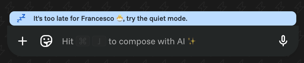
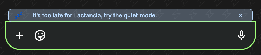
Then someone added a modal that blocked the entire screen at night: “Hey! It’s late! Want to schedule this for tomorrow?”
Users hated it. The team killed it. It went to our feature graveyard.
Then came the CPR assignment: “Revive scheduled messages. Make it not suck.”
Version 1: My First Attempt at Resurrection
Starting a CPR is weird. You know the feature failed, but you don’t want to just polish the corpse. You need to reimagine it completely.
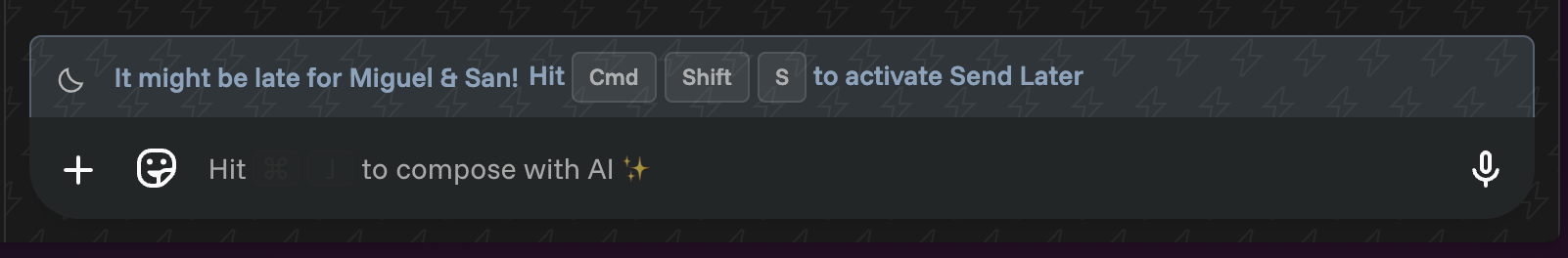
I created “Send Later Mode” — an orange bar at the top that put you in scheduling mode. Toggle on, all your messages get scheduled. I thought I’d cracked it.
Mati’s feedback arrived in 30 seconds:
“when i open the chat, the topbar animation repeats. i don’t like the animation tho. styles are not consistent. borders are different and color feels weird. it breaks shortcuts. we can do better.”
“We can do better.” The phrase that would define the next few weeks of my life.
The CPR Process: Death and Rebirth, Over and Over
CPR isn’t just about fixing what’s broken. It’s about understanding why it died in the first place and reimagining it completely. But here’s the thing: you often need to fail a few more times to understand what success looks like.
Version 2–3: I addressed Mati’s feedback. Fixed the colors, moved things around, added badges.
Mati: “i don’t like the style of the topbar. we can do better.”
The feature was already better than what my teammates had tried. But “better than dead” isn’t the bar we aim for.
Version 4: I went overboard. Tooltips, badges, counters, complex state management. 500 lines of code. “If you want better, I’ll give you everything,” I thought.
Mati: “remove effects. it is not intuitive how to get back. we shouldn’t derive the focus to the whole compose box.”
He was killing my clever solutions one by one.
Version 5: Frustrated, I suggested: “What if we just make the compose box blue when it’s in scheduled mode?”
Mati: “Better.”
One word. After weeks of “we can do better.”
What CPR Really Means
After doing several CPRs, I’ve learned it’s not about fixing features. It’s about understanding why they failed and having the courage to try something completely different.
First version failed because it was adding friction. Click button, pick date, repeat. My early versions failed because I was adding complexity instead of removing friction.
The breakthrough in v5 wasn’t adding something new. It was realizing the compose box was already there. We just needed to change its state, not build around it.
Version 6: True Resurrection
The final version was embarrassingly simple:
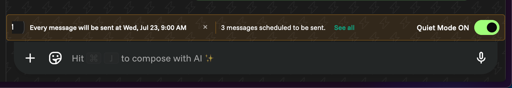
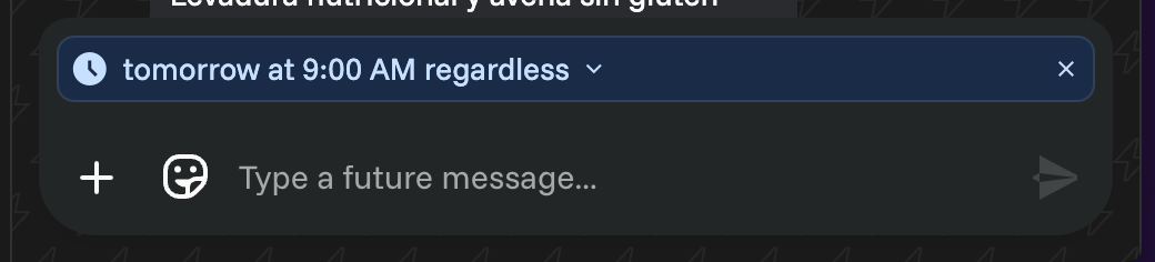
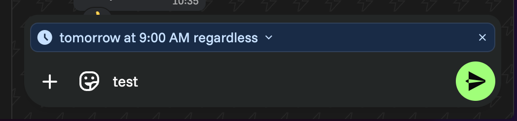
- Compose box turns blue in scheduled mode
- Clean text showing schedule time
- Small badge for pending messages
- 100 lines of code, not 500
Mati: “Good. Ship it.”
The feature that had died in my teammates’ hands, that I’d overcomplicated for 4 versions, was finally alive. And it felt like it had always belonged in WhatsApp.
What I Learned About CPR (and Design)
Here’s the truth about CPR: it’s not about who’s right or wrong. It’s about having the guts to keep pushing when everyone else would have shipped v2.
We weren’t wrong with our first attempts — we were exploring. Every “failed” version was a necessary step. The modal that blocked the screen? Had to exist for us to realize how annoying interruptions are. My orange bar? Had to exist for us to understand that different isn’t always better.
“We can do better” isn’t criticism — it’s a shared standard.
When Mati says it, he’s not saying “you failed.” He’s saying “we haven’t found it yet.” That little word “we” changes everything. It’s not his vision or my code. It’s our commitment to keep pushing until it feels right.
What this CPR taught us as a team:
- Version 1 is never the answer, it’s the question
- Simple solutions hide behind complex attempts
- If it needs instructions, we’re not done
- The best features feel like they were always there
- “Good enough” is the enemy of “holy shit, this is perfect”
The magic isn’t in Mati’s feedback or our creative process. It’s in the process of refusing to settle. Any team can ship v2 and move on. It takes a special kind of stubbornness to reach v6, to keep believing there’s a simpler solution hiding in there.
CPR isn’t about resurrection. It’s about evolution.
We’re not just bringing dead features back. We’re evolving our understanding of what makes something worth shipping. Each iteration, each “we can do better,” each thrown-away version — they’re all part of finding that inevitable solution.
Our CPR Philosophy Now
When we CPR a feature:
- Study why it died (usually: too complex)
- Try something completely different (usually: still too complex)
- Hear “we can do better” (always)
- Strip away everything (painful but necessary)
- Find the simple solution that was hiding (it’s always there)
- Ship when it feels inevitable (not when it’s impressive)
I’m currently doing another CPR. Version 4. Mati just said “we can do better.”
I know what’s coming. Versions 5 and 6 will hurt. But somewhere in that pain, we’ll find the simple solution that brings this feature back to life.
The Numbers That Matter
Before CPR: 0% of users using scheduled messages. Dead feature. Complete abandonment.
After 6 versions of “we can do better”: Over 20% of users actively using it week over week.
That’s what CPR is really about. Not just bringing features back from the dead, but making them so intuitive that people actually want to use them. The difference between 0% and 20% isn’t just design iterations — it’s the difference between a feature that makes users think and one that just works.
Turns out “we can do better” was worth the pain.
P.S.
To my teammates whose versions “failed” before